
Every four years the World Cup produces a handful of kits that outgrow the pitch entirely, and this cycle has been unusually generous with them. Part of that comes down to timing: the tournament is unfolding across the United States, Mexico and Canada in the middle of summer, right as street style feeds are hungry for new silhouettes and brands are leaning harder than ever into football as a fashion category rather than a niche sport category. Search interest in jersey-based outfits has spiked dramatically this year, and the reason isn’t just that more people are watching matches. It’s that the jerseys themselves have gotten better at being clothes.
What’s driving it is a shift in how the kits are designed in the first place. Federations and brands have clearly briefed these releases with life beyond the 90 minutes in mind — all-over graphic patterns instead of plain blocks of color, considered collar shapes, fabric weights that drape rather than cling, and design references pulled from art, architecture and cultural history rather than just crest-and-stripes tradition. The result is a wave of jerseys that read as considered garments first and match-day gear second, which is exactly what’s made them so easy to fold into everyday outfits. Pair one with straight-leg denim and battered leather sneakers and you’re in blokecore territory, a trend that’s been quietly dominating street style for a couple of years now and has found its natural home in this tournament. Pair the same shirt with tailored trousers and boots and it reads as a considered layering piece for the office. Style creators have been doing exactly this all summer, treating jerseys the way they’d treat a graphic tee or an archive band shirt, and the brands have responded by pushing the fashion angle even harder through capsule collections with streetwear labels and fashion houses alike.
The result is a wave of jerseys that read as considered garments first and match-day gear second, which is exactly what’s made them so easy to fold into everyday outfits.
Seven kits in particular have captured that crossover moment better than almost anything else this cycle, each for a different reason — one leans into heritage storytelling, one is a genuine streetwear collaboration, one plays with an unexpected colorway, and one carries centuries of cultural symbolism on the chest. Here’s a closer look at each.
Spain 26 Away Jersey
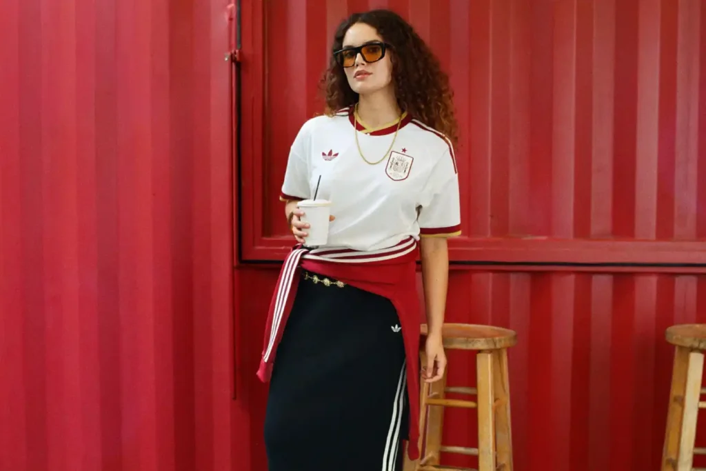
Spain’s home shirt does the expected thing well — a clean red base with the kind of pinstripe detailing that reads instantly as the national team — but it’s the away kit that’s been generating the real conversation outside football circles. Rather than falling back on a solid color or a simple gradient, adidas built the entire design around Spain’s literary heritage, covering an off-white base in an intricate all-over pattern lifted from the illustrations and decorative flourishes found in classic Spanish manuscripts. The effect is closer to the endpapers of a well-worn hardback than anything you’d typically associate with a football shirt, and that’s precisely what’s made it resonate with people who wouldn’t normally look twice at a national team jersey.
The details reward a closer look, which is part of why it photographs so well for outfit posts. The pyrite-gold pattern sits against that page-like off-white in a way that shifts depending on the light, gold and burgundy trim runs along the sleeves and collar, and the word “ESPAÑA” is worked into the back of the neck with the Ñ deliberately emphasized as a nod to the language itself. It’s a shirt that tells a story rather than just displaying a badge, and that narrative depth is exactly the kind of thing that translates well when people start styling it away from the stadium — worn open over a plain white tee with wide-leg trousers, or tucked into a midi skirt for something that leans more fashion editorial than fan gear. Retail sits at roughly £85 for the replica and around £120 for the on-field authentic version, and given how much attention the design has picked up since Spain’s deep run through the knockout rounds, sizes have been moving fast.
Nike England x Palace Collection
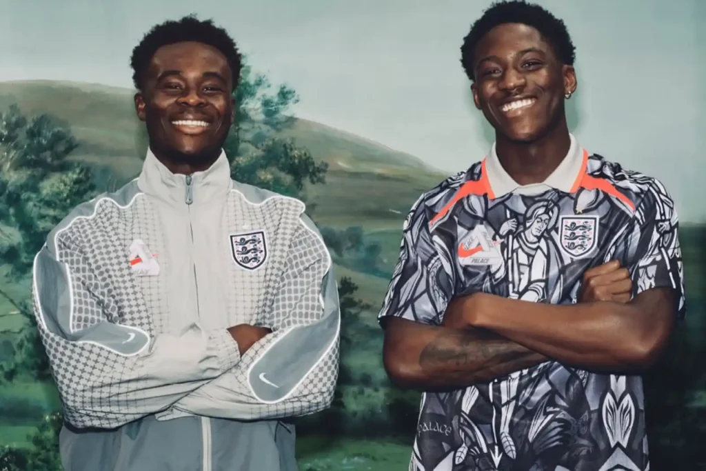
If one collaboration defines the fashion side of this World Cup, it’s this one. Palace has spent nearly two decades building its identity at the intersection of skate culture, football terraces and London street style, and this summer that history finally became official through a full capsule with Nike and the Football Association. The centerpiece jersey trades England’s usual clean white base for a dark, grayscale palette layered with an all-over stained-glass graphic depicting St. George — a design choice that immediately separates it from every England shirt that’s come before it, while still carrying enough red detailing and a classic polo collar to keep it recognizably tied to the team.
What makes the collection land as genuine fashion rather than a marketing exercise is the range around that jersey. There’s a pre-match shirt, training pieces, and an anthem jacket built as a direct homage to Nike’s Destroyer silhouette, rendered in an unmistakable infrared orange that Palace co-founder Gareth Skewis has described as the piece that ties the whole project together. Wayne Rooney and Jill Scott appeared in the campaign alongside current players like Marcus Rashford, Bukayo Saka and Harry Kane, deliberately bridging different eras of England fandom, and proceeds from the collection support Football Beyond Borders. It’s the kind of drop that skate shops and sneaker resale platforms were tracking as closely as football retailers, and pieces from the range have already shown up in outfits that have nothing to do with match day — the anthem jacket over jeans, the jersey worn loose with cargo pants, the whole thing read as a streetwear release that happens to carry a crest rather than the other way around.
Germany 26 Away Authentic Jersey
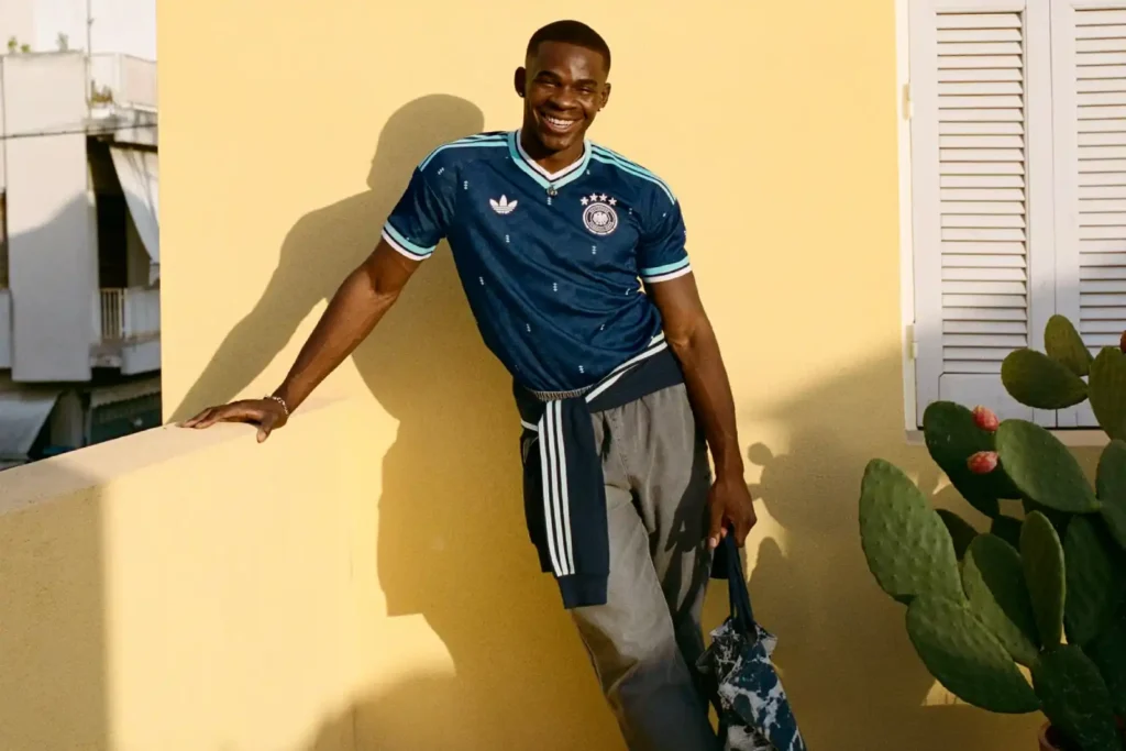
Germany’s away kit is the one built almost entirely out of nostalgia, and it’s exactly that layered history that’s made it such a hit with people who collect jerseys the way others collect sneakers. Rather than introducing something new, adidas went back through the archive and pulled references from three different eras of DFB training and match wear — the deep blue of 1954 kit, the classic blue-and-white warm-up tops that ran from the sixties through the eighties, and aqua-toned training gear from the nineties — and folded them into a single navy base finished with a distinctive zig-zag pattern lifted from vintage adidas shoebox graphics. It’s a colorway Germany has genuinely never worn before, closer to a maritime palette than the black, white and red people expect from Die Mannschaft, and that unexpectedness is a big part of why it’s traveled so well outside football.
This kit also carries the weight of being adidas’s final Germany release before Nike takes over the federation partnership in 2027, and the design leans into that ending rather than shying away from it. A woven jock tag at the hem reads “adidas Germany – Seit 1954,” the four World Cup stars above the crest are individually printed with the winning years, and the whole shirt functions as a send-off as much as a match kit. That sense of closing a chapter has made it a genuine collector’s piece, but the styling appeal is separate from that story — the navy-and-mint combination is genuinely rare in football, which means it slots easily into outfits built around navy tailoring or layered under a bomber jacket without looking like obvious fan merchandise. Standard adult pricing runs around £85, with the authentic match version closer to £130.
Mexico 26 Home Authentic Jersey
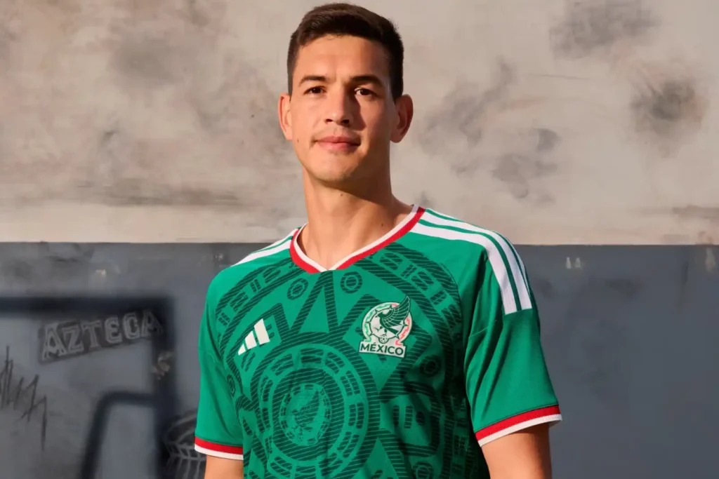
As one of three co-host nations, Mexico arrived at this tournament with more pressure on its kit design than almost anyone else in the field, and the home jersey answers that pressure by looking backward to one of the most beloved shirts in the country’s football history. The deep green base is overlaid with a bold geometric pattern directly inspired by the 1998 World Cup kit, reworked here with sharper, more intricate linework built around the Piedra del Sol — the Aztec sun stone — rather than a simplified version of it. The design carries official authorization from Mexico’s Instituto Nacional de Antropología e Historia, which is a rare and meaningful detail for a piece of sportswear, and it grounds the shirt in something considerably deeper than typical kit branding.
That cultural weight is exactly why the jersey has moved so easily into fashion territory well beyond match days. Playing host on home soil has already put Mexico’s kit in front of an enormous audience, and the shirt’s combination of a genuinely striking, symbol-dense pattern with a wearable green base means it works as a standalone piece rather than something that only makes sense at a watch party. It shows up paired with white trousers and gold jewelry for a look that leans into the design’s heritage, and just as often thrown over a plain tee with denim shorts for something far more casual — the kind of range that comes from a jersey being genuinely beautiful rather than just recognizable. The interior collar reads “SOMOS MÉXICO,” a detail most people only discover once they’re already wearing it, and pricing sits around £85 for the replica with the authentic on-field version closer to £120.
Nike France x Jacquemus Collection
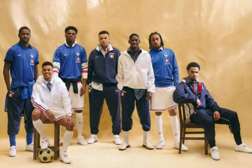
Of all the fashion-house crossovers this cycle, none feels less like a marketing exercise than what Nike built with Jacquemus for Les Bleus. Simon Porte Jacquemus grew up around football, and the collection reads like a personal memory rather than a licensing deal — it’s built directly around a vintage navy Nike tracksuit jacket he wore as a kid, reworked into a pre-match shirt in deep royal blue with fine red and white pinstripes running the length of the fabric. The crest itself is the giveaway that this isn’t a normal federation release: the traditional two-star French rooster sits above a blocky tricolor flag graphic with “JACQUEMUS” worked directly into the design, a level of co-branding federations rarely allow so close to their own badge.
What makes the collection land as genuine fashion rather than another logo-slap is the restraint running through it. Where England’s Palace capsule leans maximalist, Jacquemus goes the opposite direction — thin stripes, tonal branding, fabrics that favor classic weight over technical sheen, all filtered through the understated elegance his label is known for. The range extends into an anthem jacket in white with tonal branding (whose tricolor sleeve taping has, somewhat ironically, drawn comparisons to Adidas’s own three stripes) and a reworked Cryoshot silhouette based on the Tiempo R10 that Ronaldinho once wore. Players including Kylian Mbappé, Désiré Doué and Marcus Thuram were shot in the campaign, and part of the proceeds support Sport dans la Ville, a youth football charity. The pieces launched through Jacquemus’s own channels before reaching Dover Street Market and wider Nike retail, and that rollout alone tells you this was built to move through fashion circles first and football ones second.
Japan 26 Away Jersey
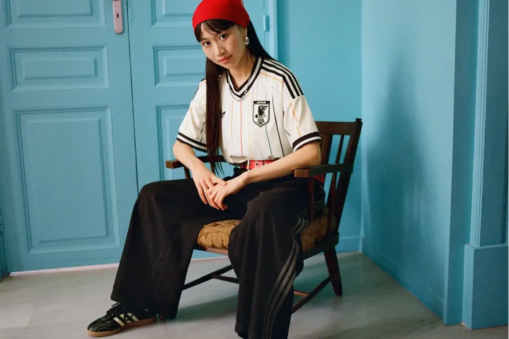
Japan’s away kit takes a completely different approach to standing out, leaning on concept rather than collaboration. Built around the idea of “Colours Beyond the Horizon,” the shirt uses an off-white base carrying eleven fading vertical stripes in different colors, each one representing a player on the pitch, with a bold central red stripe pulled straight from the sun on the national flag standing in for the fans who back them. It’s a genuinely thoughtful piece of design storytelling — the kind of concept that would usually get lost on a jersey, but here reads clearly even from a distance thanks to the gradient effect running through the stripes.
That subtlety is exactly why the shirt has traveled so well into fashion territory. Multi-colored pinstripe jerseys aren’t new, but most lean loud; this one manages a pastel, almost watercolor quality that sits closer to a designer knit than typical fan wear, which is part of why it’s shown up so often paired with tailored trousers or layered under an open shirt rather than styled as obvious matchday gear. The Japanese flag sits stamped at the back of the neck as a quiet finishing touch, and the adidas Trefoil replaces the modern performance badge, in keeping with the retro direction adidas took across all of its 2026 away kits. Retail runs around £85 for the replica, with the authentic on-field version closer to £120, and given how well it photographs, it’s become one of the more requested pieces among people building out a jersey rotation who want something that doesn’t read as a single team’s colors.
Nike Netherlands x Patta Collection
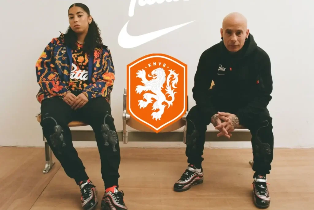
If Jacquemus brought restraint to this cycle’s collaborations, Patta brought the opposite, and the Netherlands capsule is arguably the loudest, most maximalist piece of fashion crossover in the entire tournament. Built with Amsterdam streetwear institution Patta — a label that’s been working with Nike across footwear and apparel for years — the pre-match shirt trades the Netherlands’ usual bright orange for a dark navy base completely covered in orange lion graphics and gold chain motifs, with the Patta wordmark running large across the chest alongside the Nike Swoosh and KNVB crest. It’s treated less like a football shirt and more like a graphic tee, which is precisely the point: Patta’s entire design language sits at the intersection of sport, music and neighborhood culture, and this is that language applied to a national federation for the first time at this scale.
The detailing goes deeper than it looks at first glance. The pattern draws on the diverse heritage of the current KNVB squad, working in the Surinamese Ala Kondre necklace motif alongside traditional Dutch heraldic lions as a deliberate statement about the many backgrounds that now make up the national team, and part of the collection supports Favela Street, a youth football organization. The capsule extends to a matching anthem jacket in the same navy-and-gold palette and a Cryoshot boot referencing the 1998 Mercurial, and it was fronted by Virgil van Dijk in a campaign shot by Fantastic Man photographer David Sims before the squad wore the pieces during pre-match warm-ups on the pitch. For anyone building out a jersey rotation that leans more nightlife than terrace, this is the piece doing the most work — it barely reads as football at all until you clock the crest.